Habitability
NDIS-friendly getaways
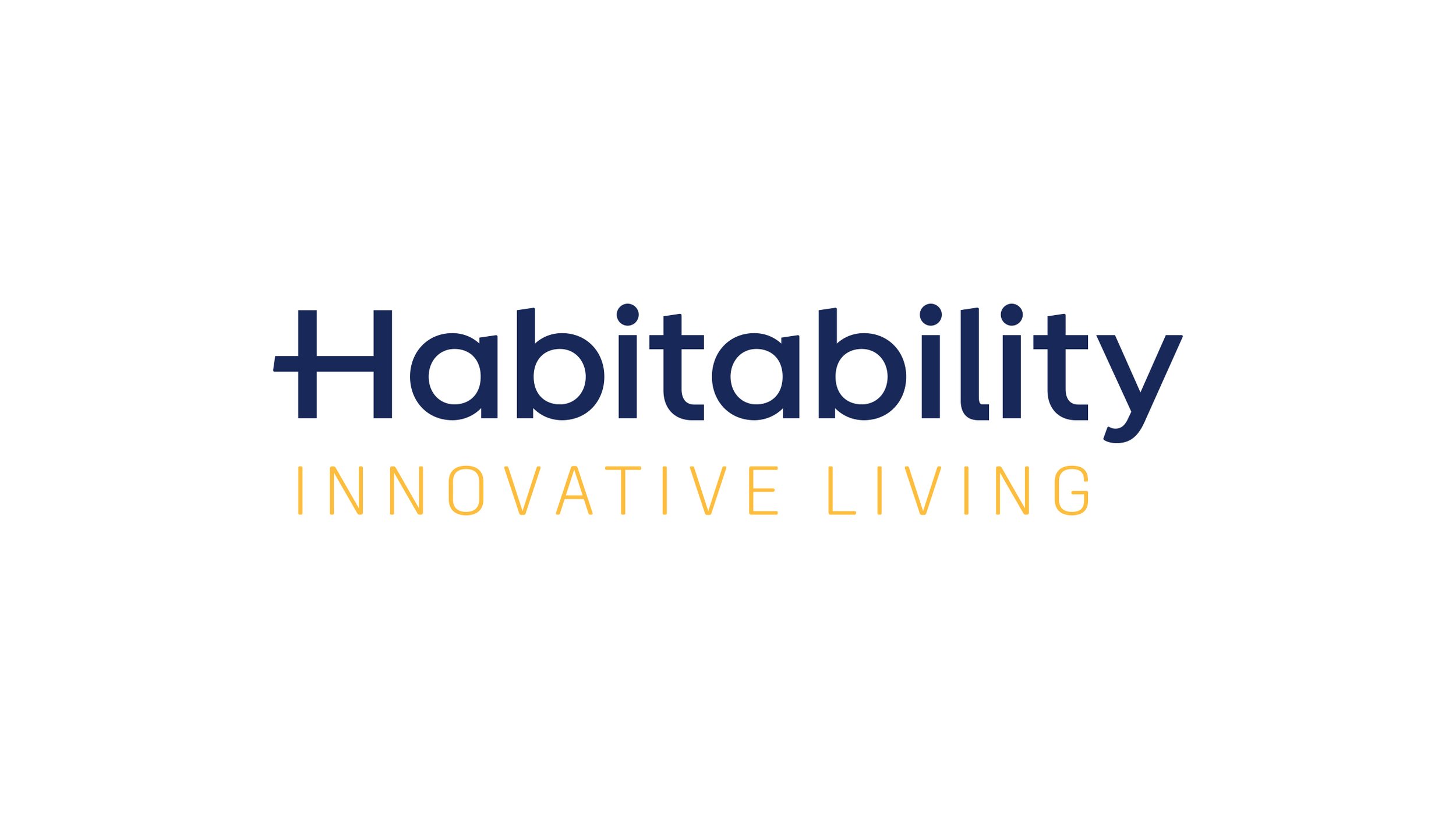
Habitability needed a brand that felt welcoming, upbeat and easy to connect with — something that reflected the joy and freedom of booking NDIS-friendly getaways. The refreshed identity leans into bright blues and sunny yellows, paired with bold, soft-edged typography that feels friendly without losing professionalism.
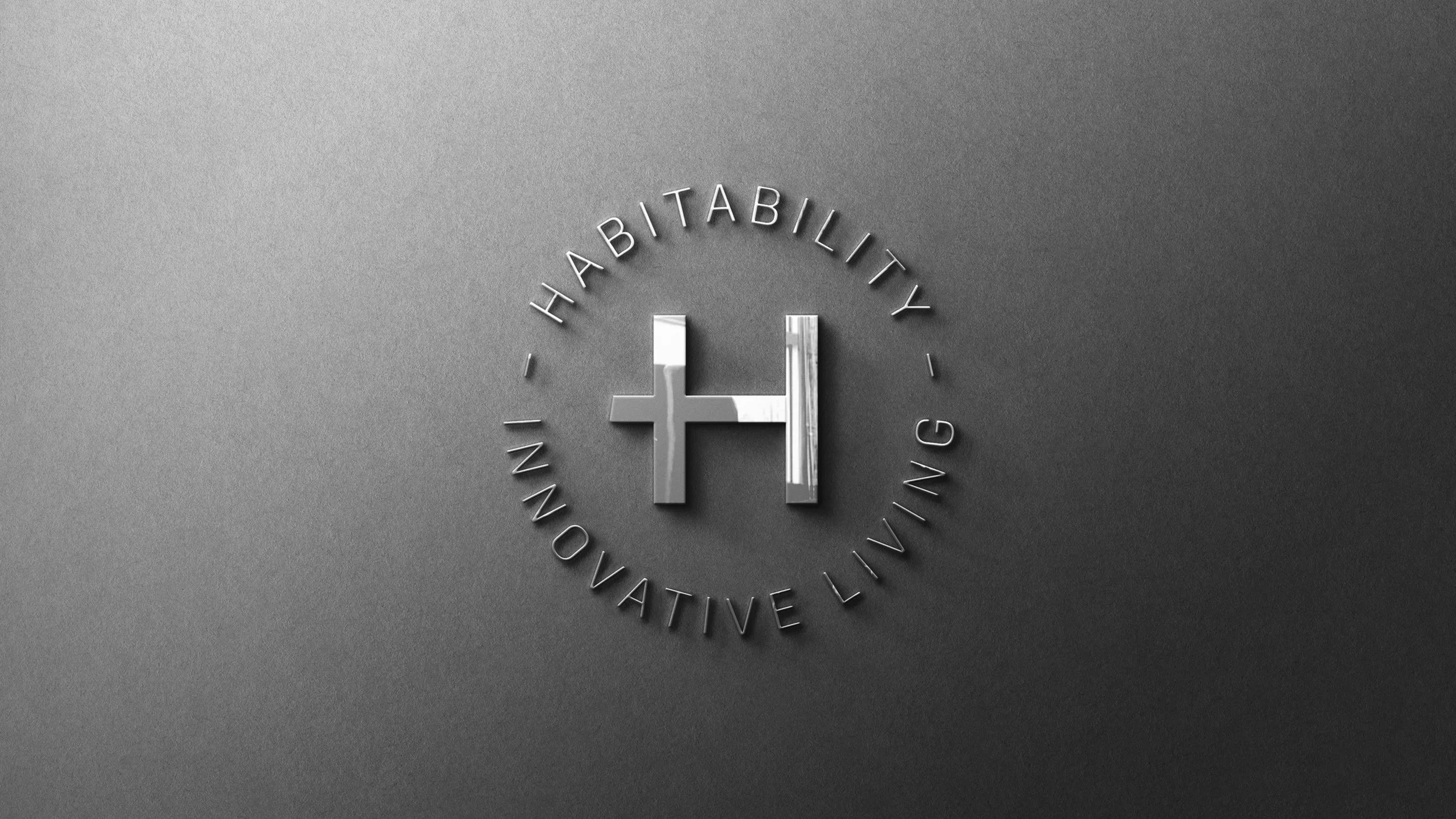
The logo keeps things clean and corporate, using a modern sans serif with a stylised H at the centre. That H becomes the foundation of the brand’s key graphic element — a start-to-finish destination line inspired by map routes. It creates a clear sense of direction, movement and possibility, tying the whole experience together.
The result is a brand that’s approachable, positive and full of momentum, built to help users feel confident from the moment they start their journey to the moment they arrive.
Scope:
Brand Identity
Brochures
Website Design