GDev (GDevelopments)
Full turn-key homes for Investors or house &land packages
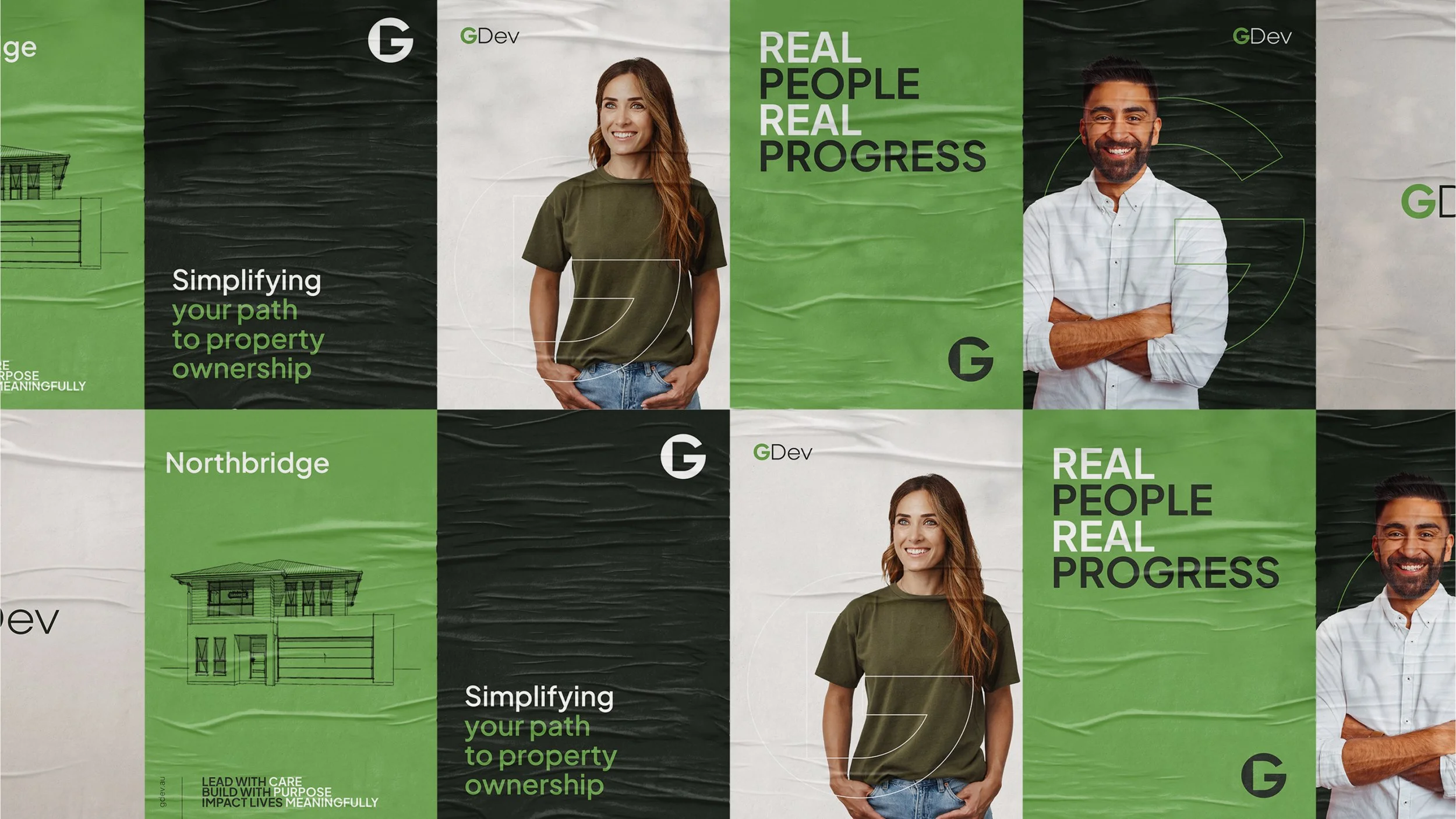
GDev came to me with history, scale and a solid reputation — but a brand that no longer reflected the quality of the homes they deliver. This rebrand brought clarity, confidence and a modern edge to a business that’s been shaping communities since 2005.
Using their established black-and-green palette as the foundation, I refined it into a more contemporary system: deep black with an olive undertone, a softer and more neutral green, and warm greys to balance it all out. The result feels grounded, trustworthy and built to last.
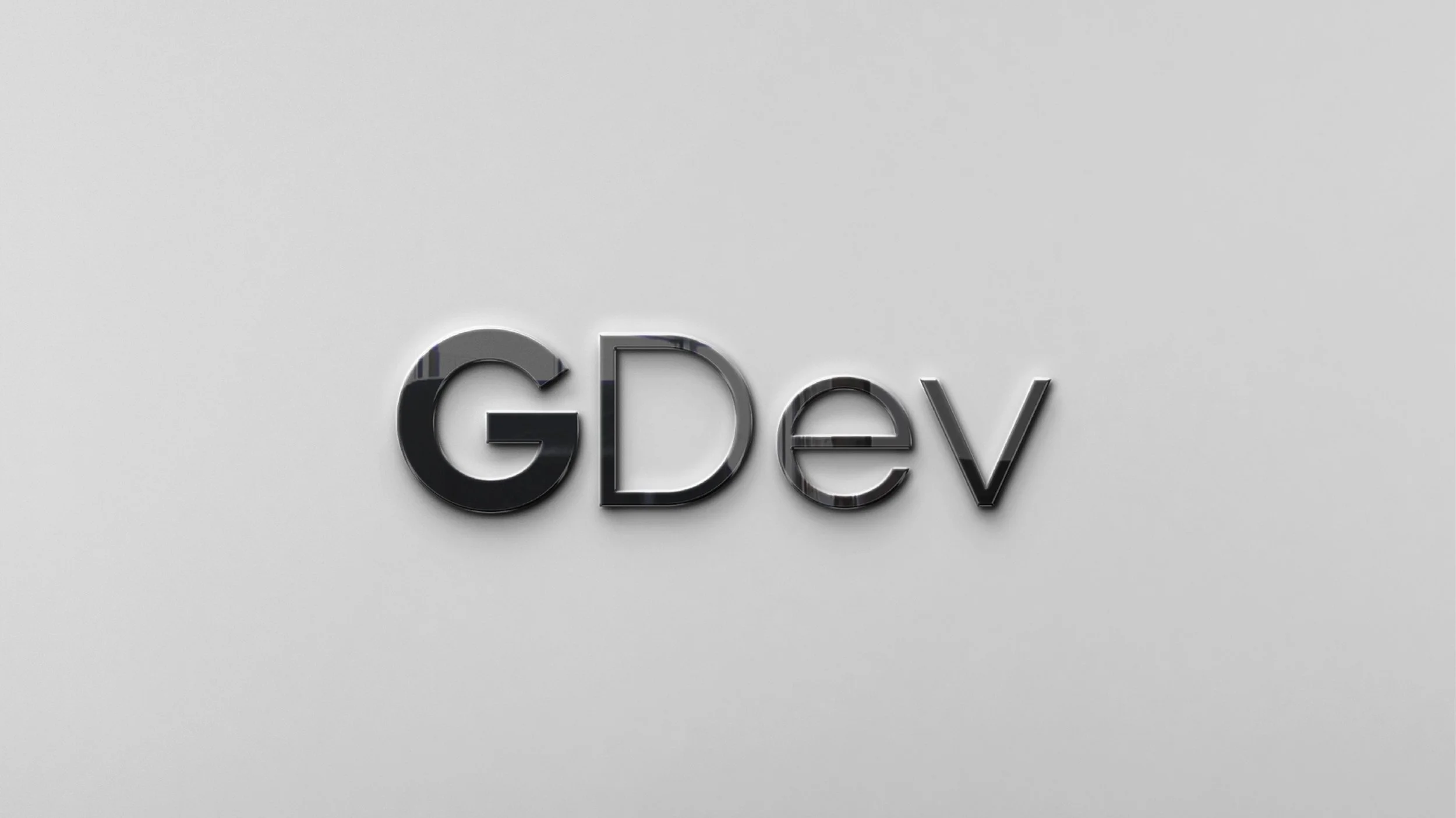
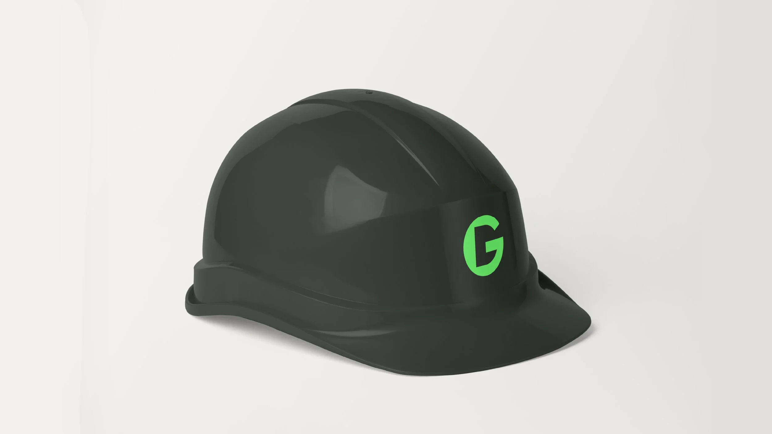
The new logo is bold and unmistakable, with an icon that forms a strong “G” and a subtle “D” in the negative space — a nod to where they’ve come from, and a clearer direction for where they’re heading.
GDev focuses on creating move-in-ready homes designed for both financial empowerment and everyday liveability. From sourcing land to handing over the keys, they streamline every step, keeping buyers informed, supported and confident throughout the process. This brand refresh gives them the presence they deserve and a visual identity as solid as the homes they build.
Scope:
Brand Identity
Brand Strategy
Tone of Voice
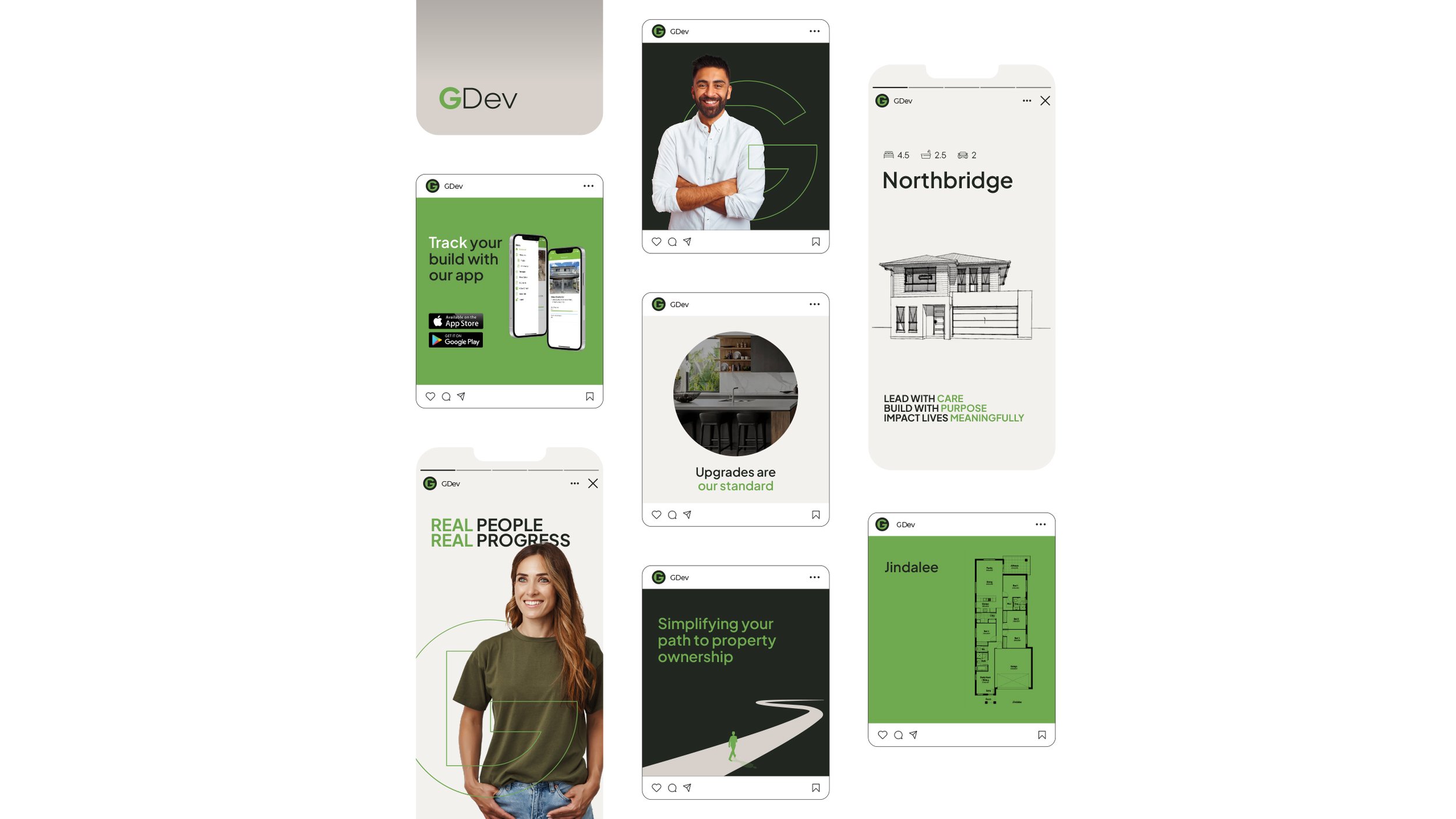
Social Media Set-up
Brochures
Stationery
Signage
Website


